How to Turn a Sketch into a Clean SVG Logo
Learn how to convert a hand-drawn logo sketch into a clean, scalable SVG, from photographing the sketch to simplifying paths and checking the final file.
 VectorArtGen Team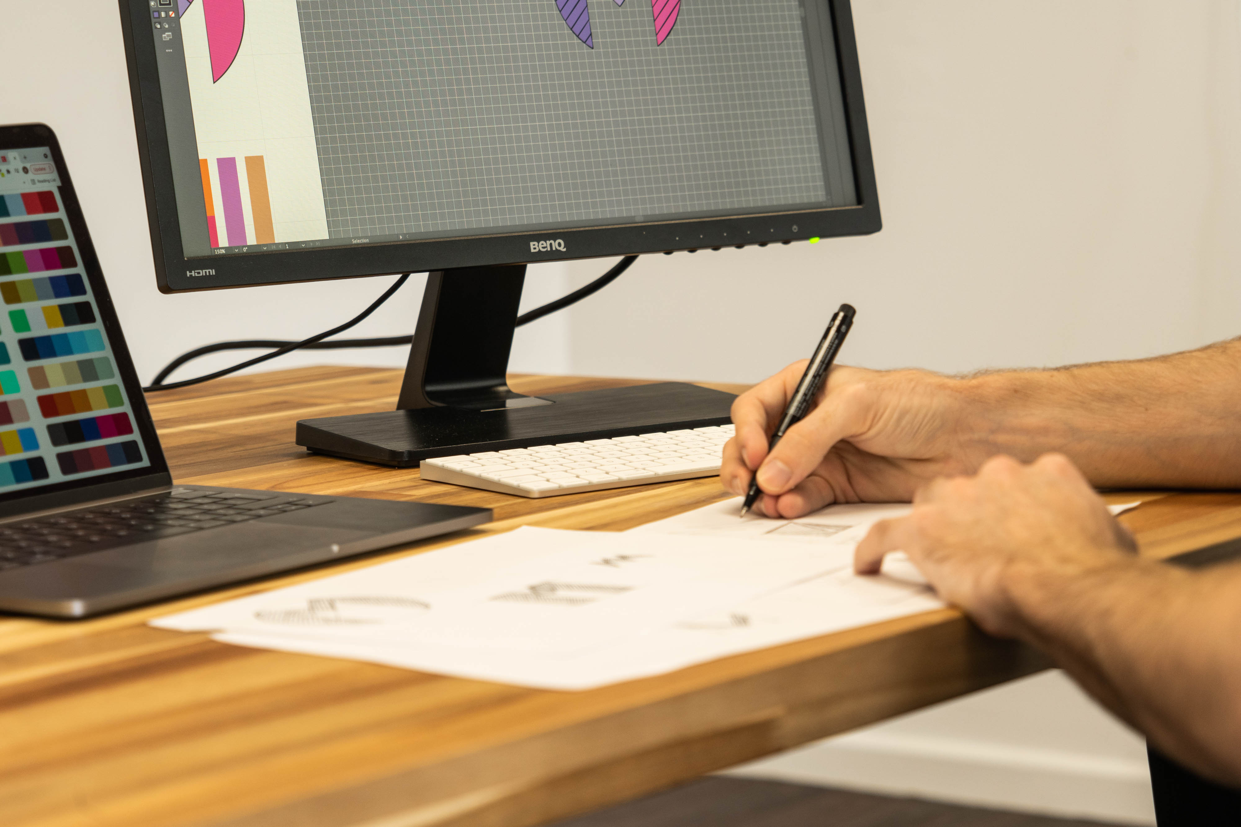
A hand-drawn sketch can be the fastest way to discover a logo idea. The challenge begins when you need to turn that idea into a clean file that works on a website, business card, product screen, or sign. A good SVG should preserve the character of the sketch while making the shapes, spacing, and colors easier to edit.
You do not need to redraw every mark from scratch. With a clear source image and a short cleanup pass, you can use an image to SVG converter to create a scalable starting point, then refine the result in a vector editor.
Cover image: Logo design sketching by Claireneon, licensed CC BY-SA 4.0. Source link requested by the creator: Custom Neon.

Start with a clear sketch
The quality of the source affects the quality of the paths. Before taking a photo or scanning the sketch, make the drawing as easy to read as possible:
- Use dark ink or a strong pencil line on clean, light paper.
- Avoid folded pages, heavy shadows, and textured backgrounds.
- Close gaps in shapes that are meant to be continuous.
- Remove notes, arrows, and construction lines that are not part of the mark.
- Draw the logo larger than its final size so small details are easier to capture.
You do not need to make the sketch perfect. You only need to make the intended silhouette and key relationships visible.
Photograph or scan the original
A flat scan is usually the easiest source to process, but a phone photo can work well too. Place the paper on an even surface, use soft lighting, and keep the camera parallel to the page. Perspective makes one side of the logo larger than the other, which can lead to uneven tracing.
Crop away the desk and empty margins before conversion. If the paper looks gray or yellow, adjust the brightness and contrast so the line is clearly separated from the background. Do not sharpen the image so aggressively that it creates halos around the drawing.
If your source is a PNG, use the PNG to SVG converter. If it is a JPG photo, use the JPG to SVG converter. PNG is often preferable for line art because it keeps edges cleaner and can preserve transparency.
Choose between tracing and generating
Tracing and text generation solve different problems:
- Trace a sketch when the original idea, silhouette, or lettering needs to stay recognizable.
- Generate a new direction when you want to explore alternatives based on the sketch rather than preserve it exactly.
- Combine both when you want to trace the core mark and use AI to explore color, layout, or supporting illustration ideas.
If you want to explore a fresh interpretation, try the AI vector generator or text to vector. Keep the original sketch as a reference so the new concept does not lose the idea that made it useful.
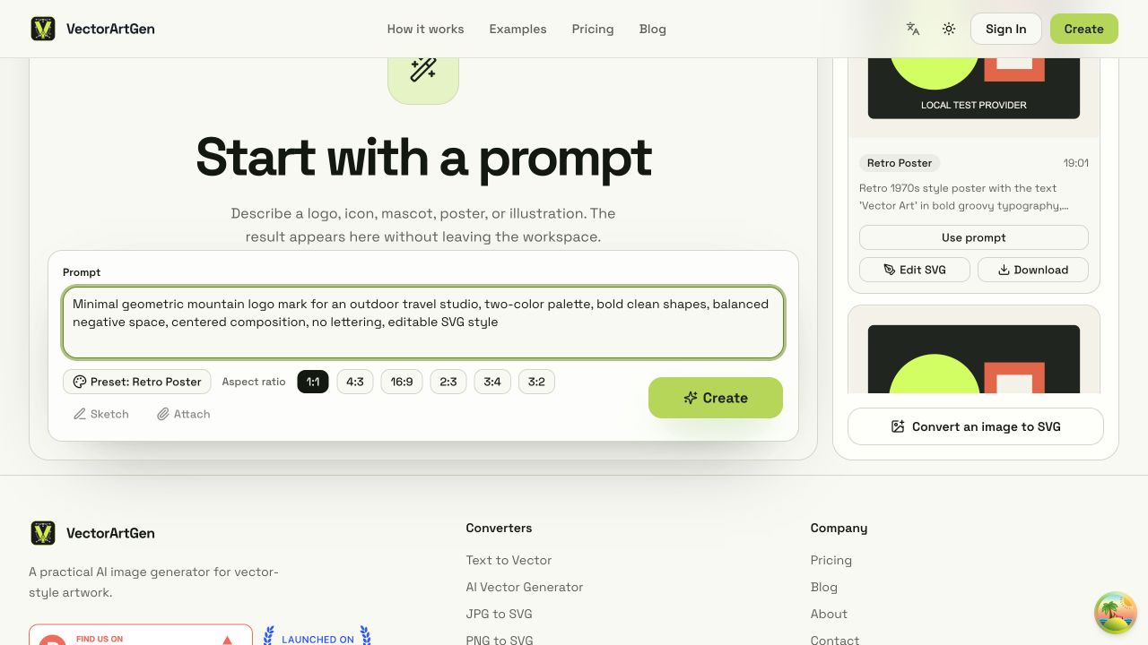
The creation workspace is useful when you want to explore a new logo direction from a structured prompt rather than trace the sketch exactly.
Convert the sketch into a first SVG
Upload the cleaned source to an image vectorizer and start with a simple result. A sketch with one dark line and a plain background usually benefits from a limited color palette and fewer paths.
When the converter offers detail or color settings, avoid choosing the highest value immediately. Extra detail can turn paper texture, pencil grain, and anti-aliased edges into unnecessary shapes. Generate a first version, inspect it, and increase complexity only if an important part of the mark has disappeared.
The first SVG is a draft, not the finished identity. Its purpose is to give you editable geometry that is faster to refine than a blank canvas.
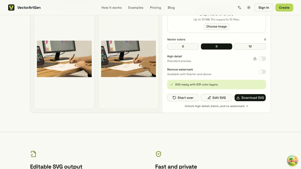
The image vectorizer shows the source sketch beside the traced SVG preview, color controls, path output, and edit/download actions.
Clean the most important paths first
After conversion, focus on the parts that affect recognition and usability:
Simplify the silhouette
Zoom out until the logo is about the size at which people will first see it. If the outer contour looks wobbly or loses its main shape, simplify it before working on tiny details. A confident silhouette is usually more valuable than faithfully preserving every pencil movement.
Remove stray objects
Delete isolated dots, paper texture, shadow fragments, and disconnected pieces that do not belong to the logo. These objects add file weight and can appear unexpectedly when the SVG is placed on a new background.
Repair gaps and overlaps
Look for broken outlines, doubled edges, and shapes that overlap in unintended ways. Make joins deliberate. If two areas should be one solid shape, merge them; if they need separate colors, keep the boundary clear.
Normalize the visual weight
Hand-drawn lines often change thickness naturally. That character can be useful, but an overly inconsistent stroke may look accidental after vectorization. Decide whether the logo should keep an expressive brush quality or move toward a more uniform geometric style, then edit consistently.
Keep typography separate when possible
If the sketch includes a company name or tagline, treat the lettering as a separate design decision. Small handwritten text can trace poorly, and generated text may contain incorrect characters.
For a production logo, recreate the wording with a suitable font or redraw the letterforms carefully in your vector editor. Keep a version with editable text when the font license and workflow allow it, and outline a final copy only when you need predictable rendering across systems.
Check the logo at three sizes
Before exporting, test the SVG in the situations where it will be used:
- Small size: Does the symbol remain recognizable as an avatar or browser icon?
- Working size: Are the spacing, colors, and line weights balanced?
- Large size: Do curves, joins, and corners still look intentional when enlarged?
Also place it on both light and dark backgrounds. A white shape that looked like empty space on the artboard may be part of the logo, and a thin outline may disappear against one of the backgrounds.
Export a useful SVG
Keep the final file organized before download:
- Use a sensible viewBox so the artwork is not surrounded by excessive empty space.
- Remove hidden objects and unused background shapes.
- Make sure the logo is not accidentally clipped.
- Use consistent fills and strokes rather than many nearly identical colors.
- Preserve an editable master copy before flattening or outlining anything.
If the result needs another cleanup pass, open it in your preferred editor or use the SVG background remover when a background layer should be separated from the mark.
Final takeaway
The goal of converting a sketch to SVG is not to preserve every imperfection. It is to keep the idea, improve the geometry, and create a file that behaves reliably at any size. Start with a clear source, trace with restrained settings, simplify the silhouette, and check the result in real use. That workflow turns a rough drawing into a logo you can actually reuse.